7 Interior Design Color Palettes That Will Dominate 2018


As you may have already heard, ultra violet is the 2018 color of the year. However, Pantone also released 2018’s interior design color palettes — a set range of colors that complement and play off of each other.
To celebrate 2018’s new color palettes and usher in a new year, AmericasMart put on a vignette exhibition called “In Living Color”. Put together by seven incredibly talented interior designers, these vignettes showcased Pantone’s interior design color palettes in innovative and unique ways.
Given that color is one of the hardest interior design decisions to make, Pantone’s color palettes offer a great starting point to build off of. To help guide your own color choice, we’re sharing how the exhibition’s most talented designers drew inspiration from Pantone’s palettes and how you can use them in your own home.
1. Resourceful
The resourceful interior design color palette is pretty straight-forward. It is the use of complementary colors blue and orange. Considering that blue and orange are both warm and cool tones, this creates a nice contrast that you can’t look away from. For this vignette, interior designer Margaret Kirkland used exotic lanterns, mirrors, doors, and wardrobes to add warm woods with an orange tone. Continuing down the exotic path, Margaret used a plush area rug and decorative plates to bring cool blues to the room. The end result was a relaxing room filled with both cool and warm colors.
How can you use the Resourceful color palette? The trick to the resourceful color palette is to use blue and orange in an innovative way — don’t take the color palette too literally and splash the colors on your wall. Instead, keep in mind that there are countless ways you can use those colors that don’t involve wallpaper or paint.
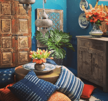
Image Credit: Margaret Kirkland
2. Playful
The name kind of implies it, but the playful interior design color palette is eclectic, eccentric, and bold. To convey a playful atmosphere, interior designer Brian Patrick Flynn used unexpected colors to create an eye-catching and exuberant space. What kinds of colors did he use? Well, he mixed teal, hot orange, and fuchsia together throughout the vignette against an ultra-white background. This created a big pop of color that gave some fun and funky vibes.
How can you use the Playful color palette? Don’t be afraid to get loud. Avoid shying away from bright colors and instead embrace them. To create cohesion among your bright colors, make a neutral like white your mainstay. This causes your color use to come across as sensible and fun instead of whacky.
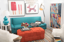
Image Credit: Brian Patrick Flynn
3. Intensity
The intensity interior design palette is all about black, gold, and strong colors coming together to create a lush and dramatic space. Interior designer Mallory Mathison started her intensity vignette by putting up a distinctive teal wallpaper, creating the foundation for the room. Then, she used touches of black, gold, rich green, and ivory to add more dramatic complements.
How can you use the Intensity color palette? Start with touches of black and gold, whether it’s in your wall colors, furniture, or light fixtures. Then look for a rich shade of blue, purple, or green to make a statement.
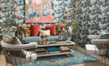
Image Credit: Mallory Mathison
4. Intricacy
The intricacy interior design palette is about mixing neutral metals with pops of color and texture. Interior designer Kristin Alber used dark metallics to add more drama and contrast to her intricacy vignette. To highlight several textures throughout the room, she kept her colors pretty neutral, making it easier to see the different textures in the space. For example, thanks to the neutral color, you could easily see the ribbed knit blanket, brushed ceramic pot, and more.
How can you use the Intricacy color palette? This color palette really celebrates different textures. To let your textures stand out, use neutral metals and colors throughout the room. Also, keep in mind that metallic doesn’t necessarily mean shiny.
5. Discretion
The discretion color palette is all about strong, masculine elements that are structured and tailored. For this vignette, interior designer André Hilton of Jordan Hilton Interiors used a mixture of masculine blues, grays, reds, and yellows throughout the space and used a wide variety of luxe textures. Our favorite textures he utilized were the wood veneer wallpaper and the mixed metals decorated throughout.
How can you use the Discretion color palette? Use a wide range of subtle hues to create a strong room. This also allows your small uses of color or new textures really stand-out.
Image Credit: Jordan Hilton Interiors
6. Verdure
Verdure is defined by Merriam-Webster as the greenness of growing vegetation. With this guidance, interior designer Chris Socci turned to greenery and woods to give his vignette peacefulness and personality. Chris also took extra consideration where color was concerned, choosing to use shades of green that were still youthful like mid-tone and olive. Thoughtful use of color aside, our favorite item in Chris’s vignette was by far the bike bar. The bike bar also fit well with the color palette thanks to its wood table top and sustainability factor.
How can you use the Verdure color palette? Make your home a peaceful, yet youthful place by introducing greenery and other natural elements like reclaimed wood tables and natural fiber area rugs into your home.
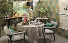
Image Credit: Chris Socci
7. Tech-Nique
Interior designer Corey Damen Jenkins describes his interior design color palette, Tech-Nique, as “a joyful celebration of vivid, unabashed color and pattern with a mix of both traditional and modern.” While the furniture in his vignette rang more traditional, Corey used the walls of the room and the fixtures on those walls to introduce modern celebrations of color. For example, Corey used vibrant wallpaper, a colorful patterned area rug, and abstract art to liven up an otherwise more elegant and traditional space.
How can you use the Tech-Nique color palette? Create a fun, contrasting mix of elements in your home with patterned walls, colorful light fixtures, new wall art, technology, and more.
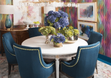
Image Credit: Corey Damen Jenkins

Sign Up and Save 10%
No, Thanks
